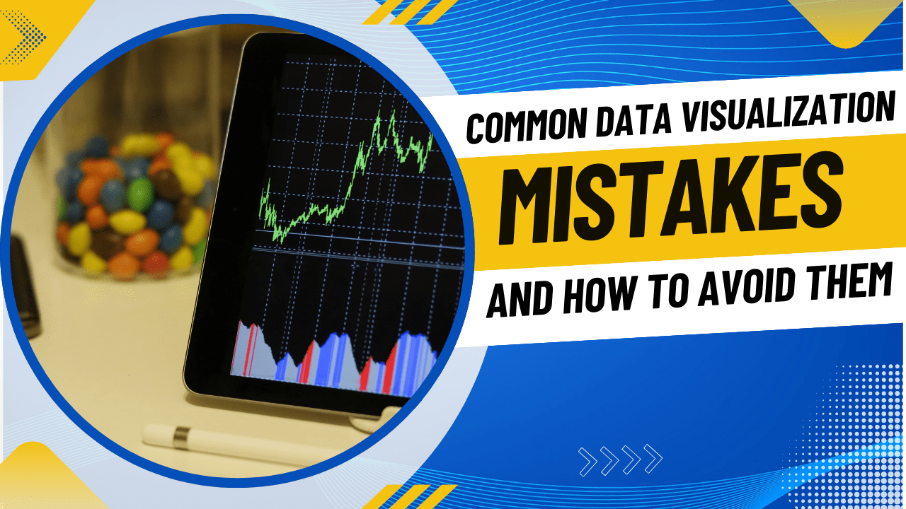
Have you ever come across a chart that confused you more than it clarified? You’re not alone. Poor visuals can hide insights, mislead decisions, and reduce trust in data.
Common data visualization mistakes are one of the biggest reasons reports fail—even when the data itself is accurate.
In today’s data-driven world, visuals should clarify, not complicate. Whether you’re a student, analyst, marketer, or business owner, presenting data correctly is a critical skill.
This guide breaks down the most frequent data visualization errors and shows you how to avoid them with practical, easy-to-apply solutions.
Mistake #1: Choosing the Wrong Chart Type
One of the most common data visualization mistakes is using an inappropriate chart for the data.
Why This Happens
-
Lack of understanding of chart purposes
-
Using default chart options in tools
-
Prioritizing looks over clarity
How to Avoid It
Use this simple rule:
-
Bar charts → Compare categories
-
Line charts → Show trends over time
-
Pie charts → Parts of a whole (limit categories)
-
Scatter plots → Relationships between variables
Choosing the right chart improves clarity instantly.
Mistake #2: Overloading Charts with Too Much Data
Trying to show everything at once often results in cluttered, unreadable visuals.
Signs of Data Overload
-
Too many colors
-
Excessive labels
-
Multiple data sets crammed together
How to Avoid It
-
Show one key insight per chart
-
Break complex visuals into multiple simple charts
-
Remove non-essential elements
Simple charts communicate faster and more effectively.
Mistake #3: Poor Use of Color
Color misuse is one of the most overlooked data visualization errors.
Common Color Mistakes
-
Using too many colors
-
Low contrast between text and background
-
Ignoring color-blind accessibility
How to Avoid It
-
Use 2–4 consistent colors
-
Maintain high contrast
-
Use color to highlight meaning, not decoration
Use neutral tones for context and bold colors for emphasis.
Mistake #4: Misleading Scales and Axes
Incorrect axis scaling can distort reality and mislead viewers—sometimes unintentionally.
Examples of Misleading Visuals
-
Truncated Y-axis exaggerating differences
-
Uneven intervals on axes
-
Missing axis labels
How to Avoid It
-
Start axes at zero when appropriate
-
Clearly label units and values
-
Keep scale intervals consistent
Accurate scales maintain trust.
Mistake #5: Ignoring the Audience
A visualization that works for analysts may confuse non-technical stakeholders.
Why Audience Context Matters
-
Different data literacy levels
-
Different goals and expectations
How to Avoid It
-
Use plain language labels
-
Add short annotations explaining insights
-
Avoid jargon and complex metrics
Before sharing, ask:
“Can my audience understand this in 10 seconds?”
Mistake #6: Lack of Context and Storytelling
Charts without context are just numbers on a screen.
What’s Missing?
-
No title explaining the insight
-
No explanation of why the data matters
-
No takeaway
How to Avoid It
-
Write clear, insight-based titles
-
Add short captions or callouts
-
Connect visuals to business or real-world impact
Good data visualization tells a story, not just facts.
Mistake #7: Using 3D and Decorative Effects
3D charts may look attractive, but they often reduce accuracy and readability.
Why 3D Is a Problem
-
Distorts perception
-
Hides actual values
-
Distracts from insight
How to Avoid It
-
Stick to clean 2D visuals
-
Remove shadows, gradients, and animations
-
Focus on accuracy over aesthetics
Clarity always wins over decoration.
Frequently Asked Questions (FAQs)
What is the biggest mistake in data visualization?
Prioritizing design over clarity, which leads to confusion instead of insight.
How colorful should a chart be?
Ideally, 2–4 colors to maintain focus and accessibility.
Are pie charts bad?
Not always. They work best when showing simple proportions with limited categories.
Conclusion
Avoiding common data visualization mistakes is not about being a designer—it’s about being clear, honest, and audience-focused.
By choosing the right chart, simplifying visuals, using color wisely, and adding context, you can transform raw data into powerful insights.
Great data visuals build trust, improve decisions, and communicate faster.